
The Importance of Mobile-Friendly Website Design in 2026
There’s a simple reality that most businesses still underestimate.
Your website is no longer being judged on a desktop screen first.
It is being judged in the palm of a hand.
In 2026, the majority of users will experience your brand for the first time through a mobile device. Not a laptop. Not a large screen. A phone.
And that single shift has completely redefined what “good web design” actually means.
A website that is not optimized for mobile is no longer just inconvenient, it is effectively incomplete.

The Shift to Mobile-First Behavior
Over the past few years, user behavior has changed dramatically.
People no longer “sit down” to browse the internet. They live inside it.
They scroll while commuting, search while multitasking, and make decisions in real time from their phones.
This means your website is constantly being evaluated in fast, distracted environments.
If the experience is not smooth immediately, users don’t adjust. They leave.
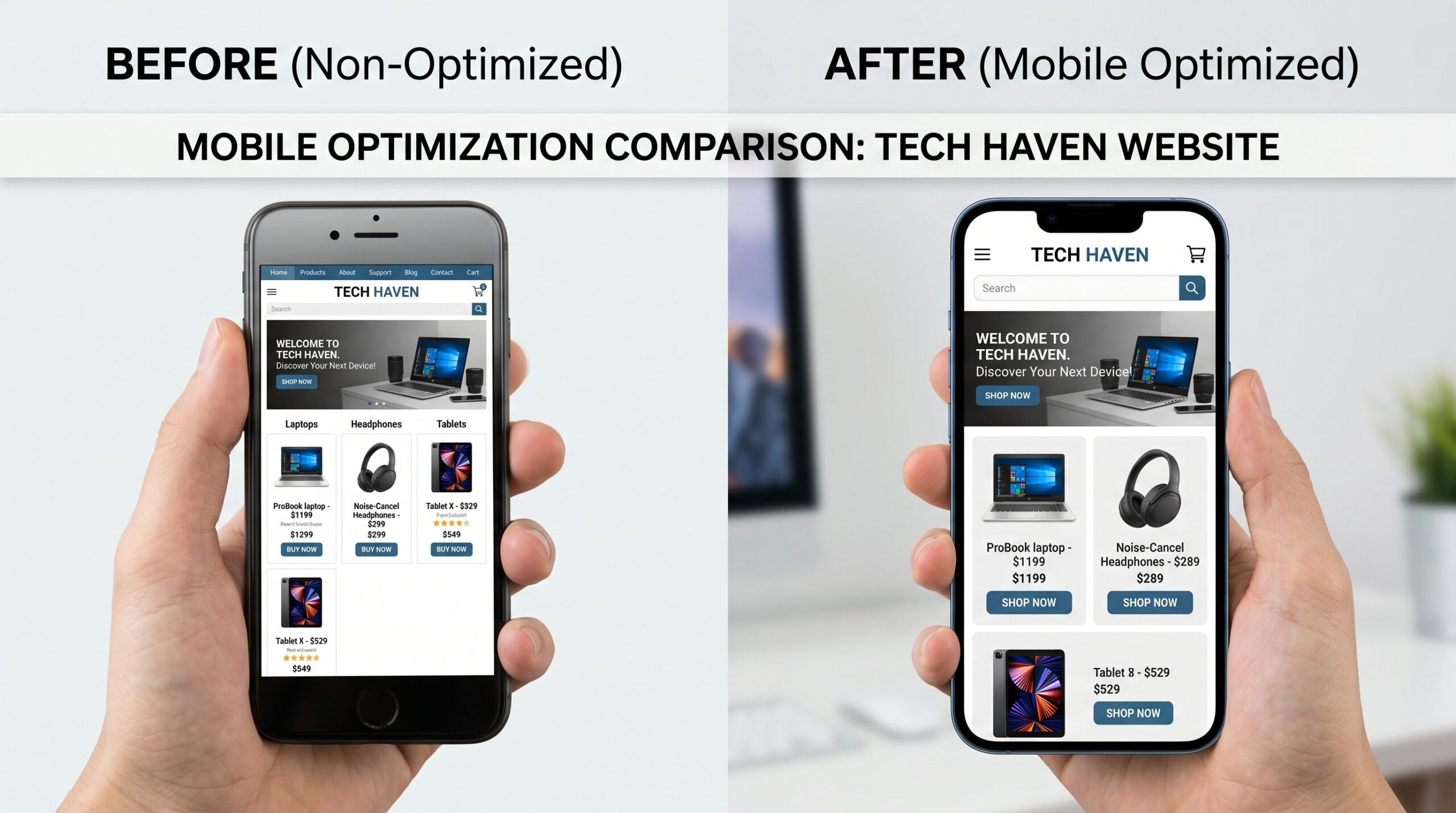
What Mobile-Friendly Really Means Today
Mobile-friendly design is often misunderstood as simply “making things fit on a smaller screen.”
But in reality, it goes much deeper than that.
A truly mobile-optimized website considers:
- How users interact with touch, not clicks
- How quickly content appears on slower connections
- How readable text feels without zooming
- How navigation works with minimal effort
- How fast actions can be completed
It is not just adaptation; it is redesigning for behavior.
Why Mobile Experience Directly Affects SEO
- Mobile usability
- Load speed on mobile networks
- Content structure on small screens
- Overall user interaction quality
User Experience: The First Impression Factor

On mobile, first impressions happen faster and more critically.
A user landing on a poorly optimized mobile site immediately feels friction:
- Text feels too small
- Buttons are hard to click
- Pages feel crowded or slow
- Navigation feels unclear
And once that friction appears, trust drops instantly.
A smooth mobile experience, on the other hand, creates a sense of ease that directly translates into credibility.
Mobile Design and Conversion Behavior
Mobile users behave differently from desktop users.
They are more impulsive, more time-sensitive, and more likely to abandon a process if it feels complicated.
That means every extra step matters.
If a form is too long, if a button is unclear, or if navigation feels confusing, conversions drop significantly.
On mobile, simplicity is not a design preference, it is a conversion requirement.
Why Many Businesses Still Get It Wrong
- Prioritizing essential content
- Removing unnecessary complexity
- Designing for thumb navigation
- Structuring information vertically
Mobile Experience as Brand Experience
On mobile, your website is not just a platform, it is a brand interaction.
And that interaction often happens before any human contact, before any sales conversation, and before any deeper engagement.
A smooth mobile experience reinforces professionalism.
A poor one quietly damages credibility even if the product or service is strong.
The Competitive Advantage of Mobile Optimization
In many industries, mobile optimization is still inconsistent.
This creates an opportunity.
Brands that invest in mobile-first experiences gain:
- Higher engagement rates
- Better SEO performance
- Stronger conversion funnels
- More consistent user retention
Because in a competitive digital space, experience becomes a differentiator.
FAQ

In today’s digital environment, users don’t experience your website on big screens first.
They experience it in motion, on mobile devices, in real time.
And that first mobile interaction often decides everything that comes after.
At Media90z, we design websites with a mobile-first mindset. Where performance, usability, and conversion are built into every interaction.